
TheyCallMeTanner
Too many businesses get lost in the noise of generic design, forgettable content, and marketing that feels forced. Their problem isn’t effort. It’s clarity.
You know what you stand for, but translating that into visuals, words, and a strategy that connects? That’s where things get stuck.
TheyCallMeTanner exists to cut through the clutter and to bring ideas to life in a way that's authentic, effective, and built for the long run.
◽️ Design - From brand IDs to clean, memorable visuals.
◽️ Video - Aggressive editing and visual messaging to hook attention.
◽️ Photography - Lifestyle and product photography shot to connect.
◽️ Marketing - Strategy and data-backed execution that helps you reach the right audience.
◽️ Creative Direction - Guidance that brings every piece together into a clear story.
This studio lacks layers of account managers and endless red tape.
Clients work directly with Tanner, who brings years of experience in high-end design, commercial photography, video production, web and social media content, and marketing to the table.You get work that’s personal, streamlined, and done with 100% intention.
Recent Accomplishments
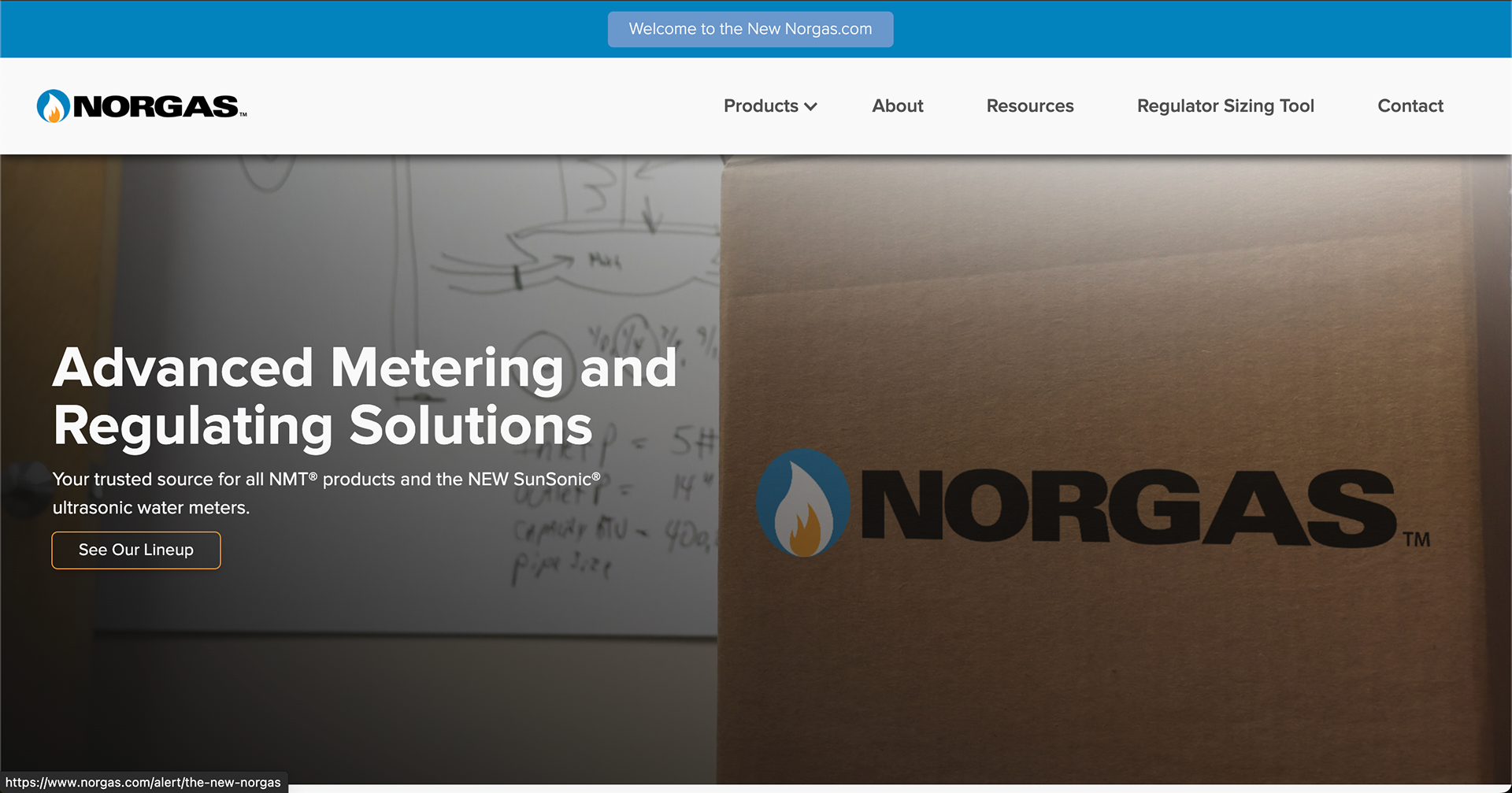
About Norgas
Norgas (www.norgas.com) is a premier distributor of gas regulators, gas meters, and water meters throughout North America. Their focus is on supplying reliable products, technical expertise, and keeping various gas and water systems running safely and efficiently.
Project Goal
Modernize Norgas’ brand presence, enhance clarity across product lines, and create a range of marketing materials (including tradeshow materials, company merchandise, sales collateral, and digital resources) that position the company as both technically credible and customer-focused. This involved developing a consistent voice, refreshed visuals, and tools that support both sales teams and end-users.
Challenges & Solutions
Along with their outdated marketing materials and inconsistent visuals, Norgas had a limited digital footprint, which made it more difficult to showcase their expertise and engage with new audiences.
I redesigned their catalogs, technical documents, and online resources to highlight clarity, accessibility, and professionalism. I also introduced simplified product descriptions, clear categorization, ways to track their online performance, directed the development of their online tools and resources, and updated visuals that help customers make faster, more confident decisions.
Outcome
The refreshed marketing strategy positioned Norgas as a modern, reliable partner in the energy industry. With a stronger online presence, consistent branding, and updated product materials, Norgas is better equipped to support its customers, attract new business, and reinforce its reputation for quality and expertise.
Mono Cards: Website Consultation
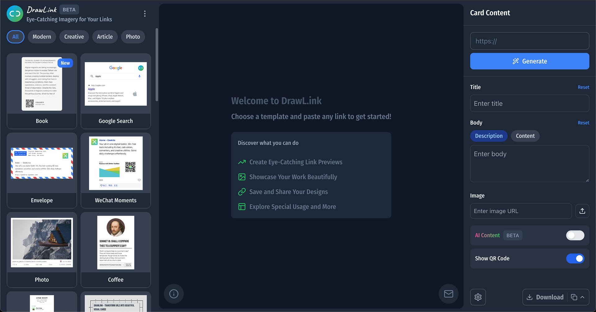
About DrawLink
DrawLink (www.mono.cards) is a platform for creative collaboration. This provides intuitive tools that make visual communication seamless. Perfect for artists, designers, and teams, it bridges the gap between imagination and execution, all in a dynamic, user-friendly environment.
Project Goal
They needed the overall design of the platform to improve the user experience.
Challenges & Solutions
I addressed critical aspects of the platform that required more attention and improvement. Areas such as the imagery, branding elements throughout the website, copy, button placement, terminology, marketing, iconography, linking and routing logic, and website responsiveness were pointed out. I also provided suggestions to improve these different parts of the platform.
Outcome
Their users were happy to finally see this platform get the attention and improvements it deserved. They reported a significant improvement in UX and its design overall.
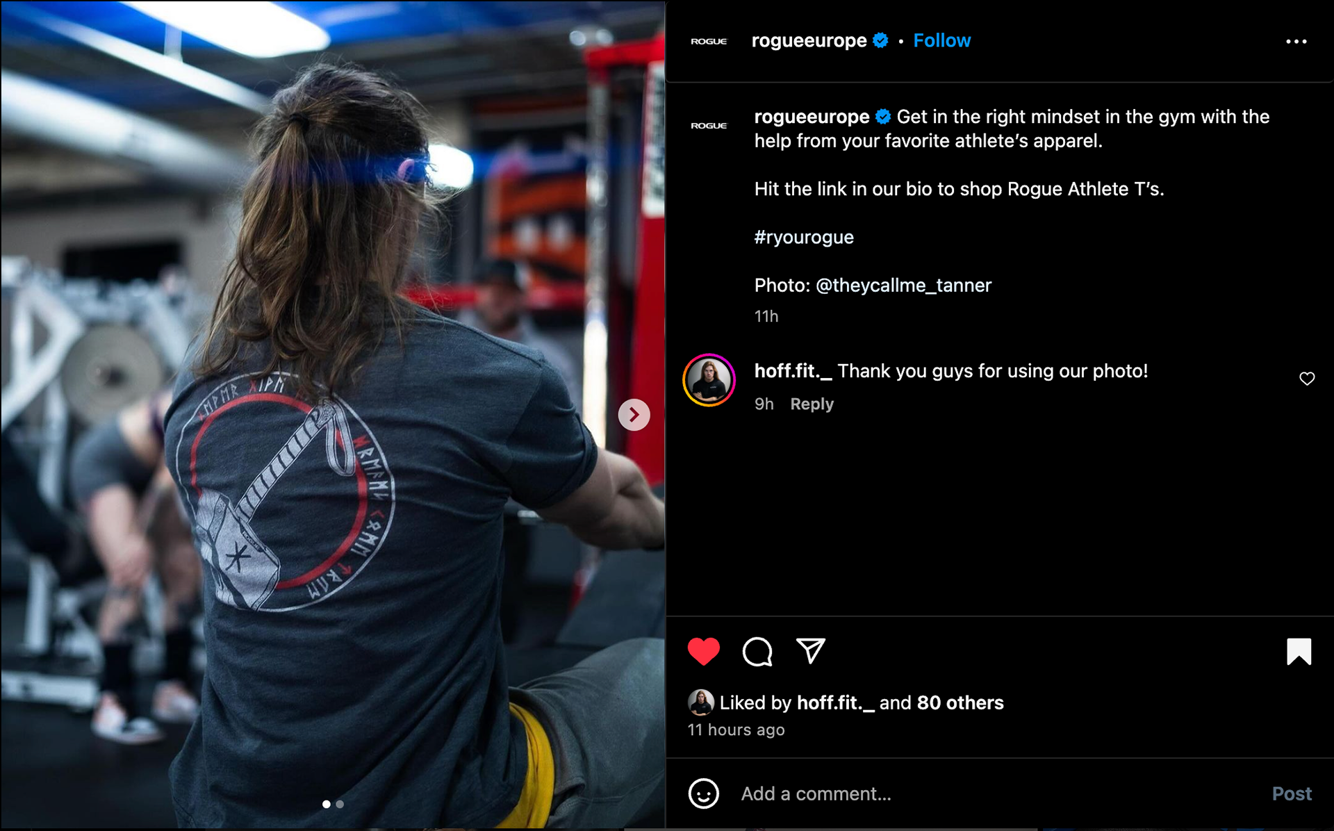
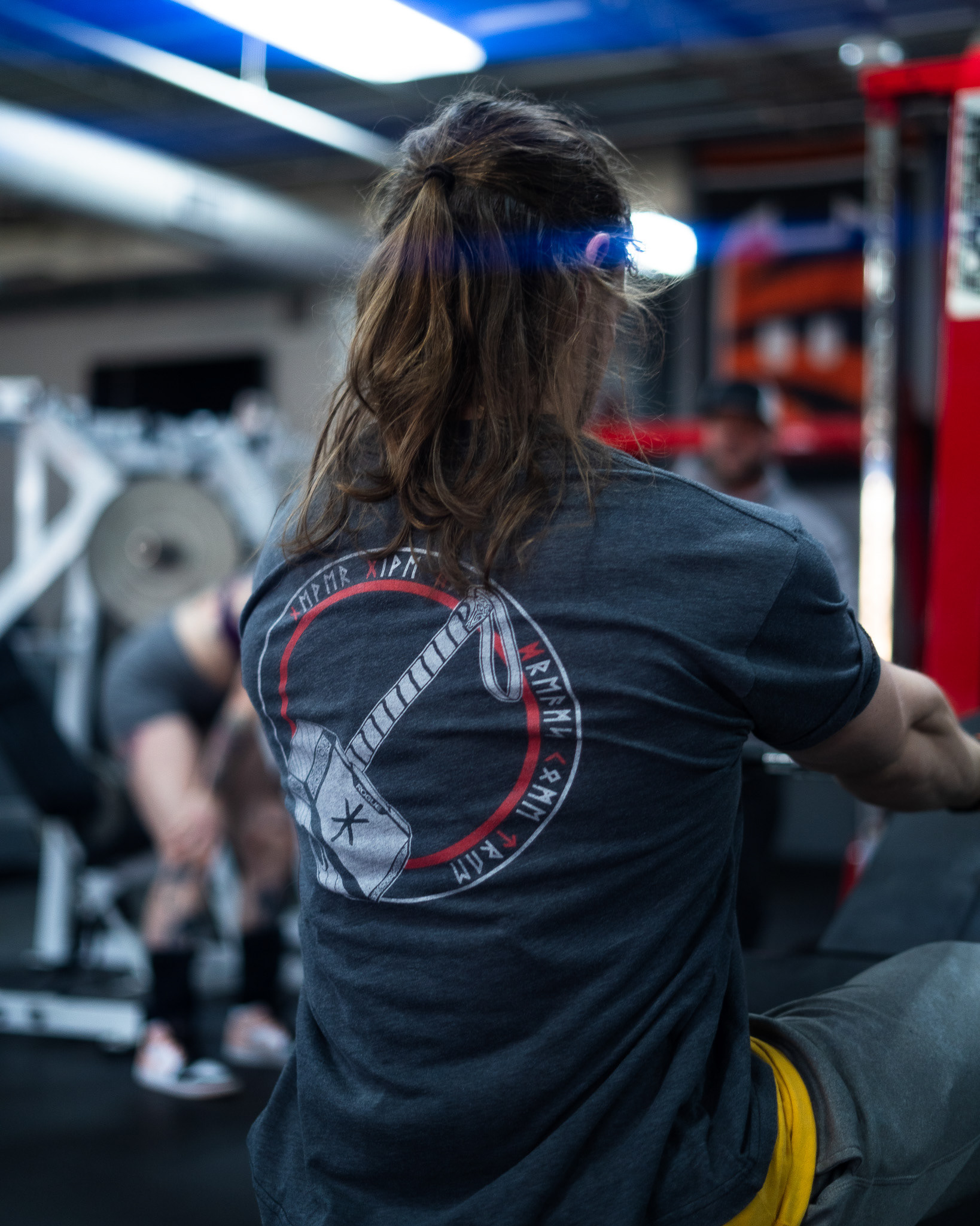
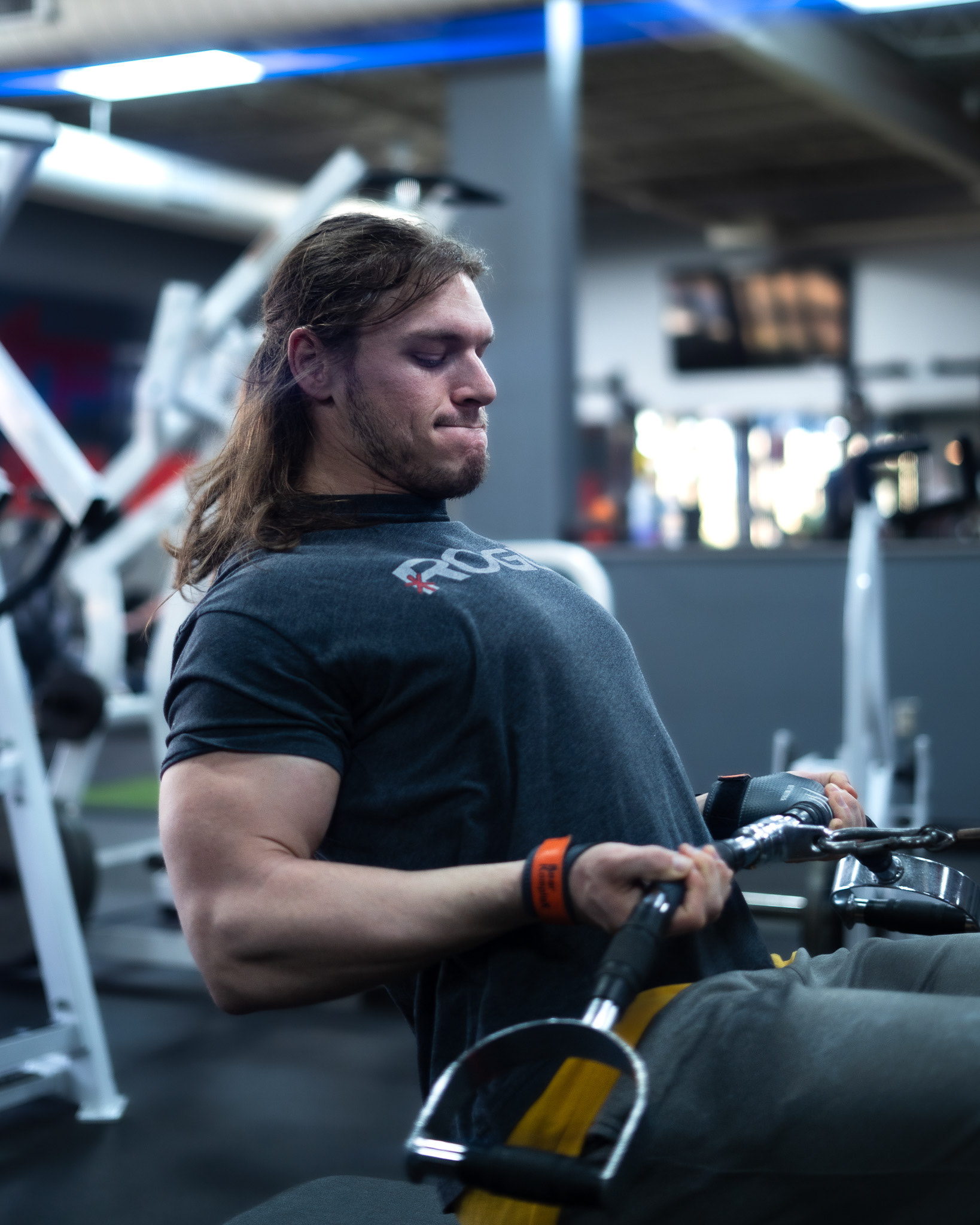
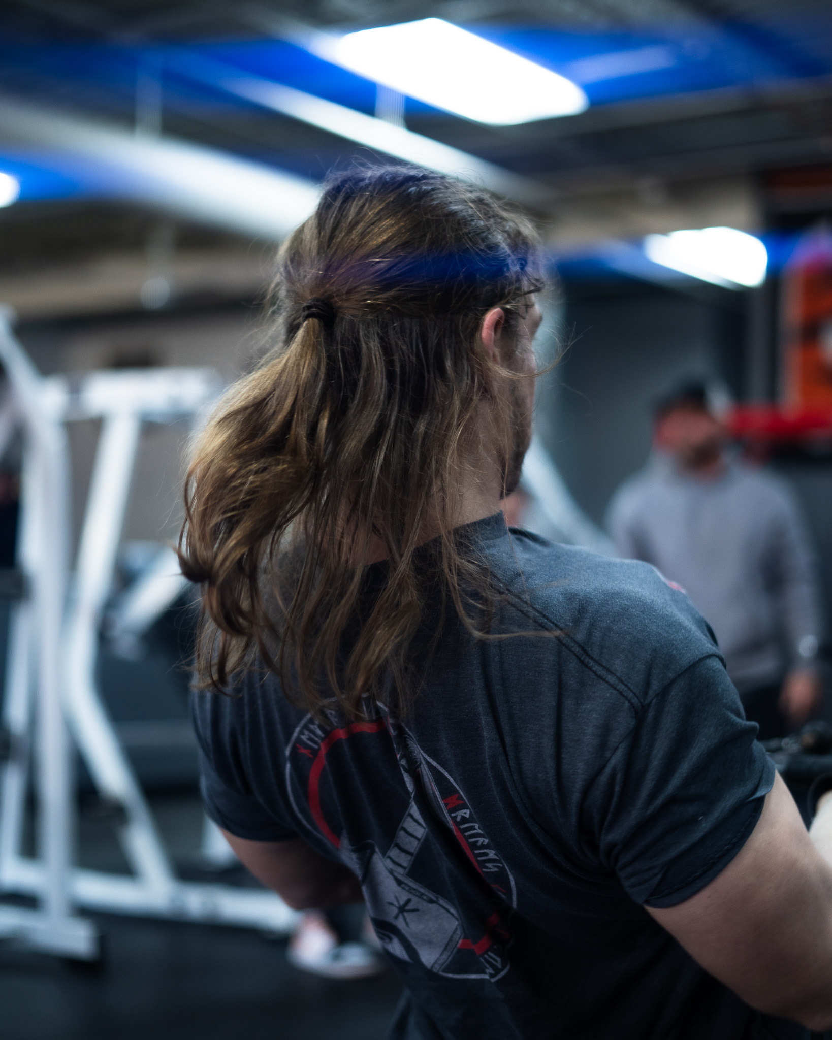
Featured on Rouge Fitness, Europe.
About Rouge
Rogue Fitness (www.roguefitness.com) is a leading manufacturer and supplier of high-quality fitness equipment, known for its durable, American-made products crafted for athletes, fitness enthusiasts, and strength training professionals.
Concept & Creative Direction
Highlight their athletic shirt in a real gym environment, placing the product in a setting familiar to Rogue's dedicated, fitness-minded audience.
Challenges & Solutions
Shooting in an active gym environment presented a few challenges: managing natural light based on the gym’s lighting, positioning the model without disruptive background distractions, and capturing clear, dynamic shots that highlighted both the model's movement and the shirt's fit.
Specific areas of the gym that offered cleaner, less cluttered backgrounds were targeted. Lighting was carefully balanced to accentuate the shirt and model, while also avoiding harsh shadows.
Styling & Art Direction
Minimal and intentional, enabling the Rogue shirt to be the clear focus while complementing the intense gym setting. The model wore neutral-colored athletic bottoms that didn’t compete with the shirt’s branding, reinforcing the shirt as the standout piece.
Rogue Fitness has permission to feature these images on any of their social media accounts, websites, or other platforms as they wish.
Follow me