Velare
Brand ID
Design Brief
Company Description:
We are a company that makes affordable motorcycle with an emphasis on sustainability. Our target audience is couples. We want to convey a sense of elegance while at the same time being approachable.
Job Description:
You must create the total branding package. This includes creating an appropriate brand name, a consistent visual system, and of course a great logo.
Deadline:
10 days.
Name
Velare was found from the Latin word "velum" meaning “veil” or “covering”. This term ties into the sustainable efforts this brand has in their lifestyle. "Velare" goes a step further by evoking a sense of elegance and sophistication, while still being approachable.
Color Palette
The Velare brand uses two colors: dark green (#02321D) and gold (#FFD81E). These colors represent Velare’s elegance and dedication to support a sustainable future.
Logo
This needed to be distinctive enough to be memorable and simple enough to describe to others. We wanted it to signal the brand's concept and idea but usable on products, marketing materials, and other brand products that would follow.
The shield was found to be a symbol that represented reliability, protection, strength, and durability. The shield is elegant and approachable in design depending on the style used.
Its shape was based on the outline of a v-twin motorcycle engine to tie back to the founder's love for motorcycles. The dark green and gold create a shield emitting a golden reflection of light. This intuitively communicates the brand high regard for the motorcycle enthusiast and a greener future.
Visual System
Velare's visual system feels and appears real so that it is felt these products will literally enhance the quality of life for these couples. Images of real people, places, and things will be prioritized while illustrations, if any, will be used to compliment the overall design.
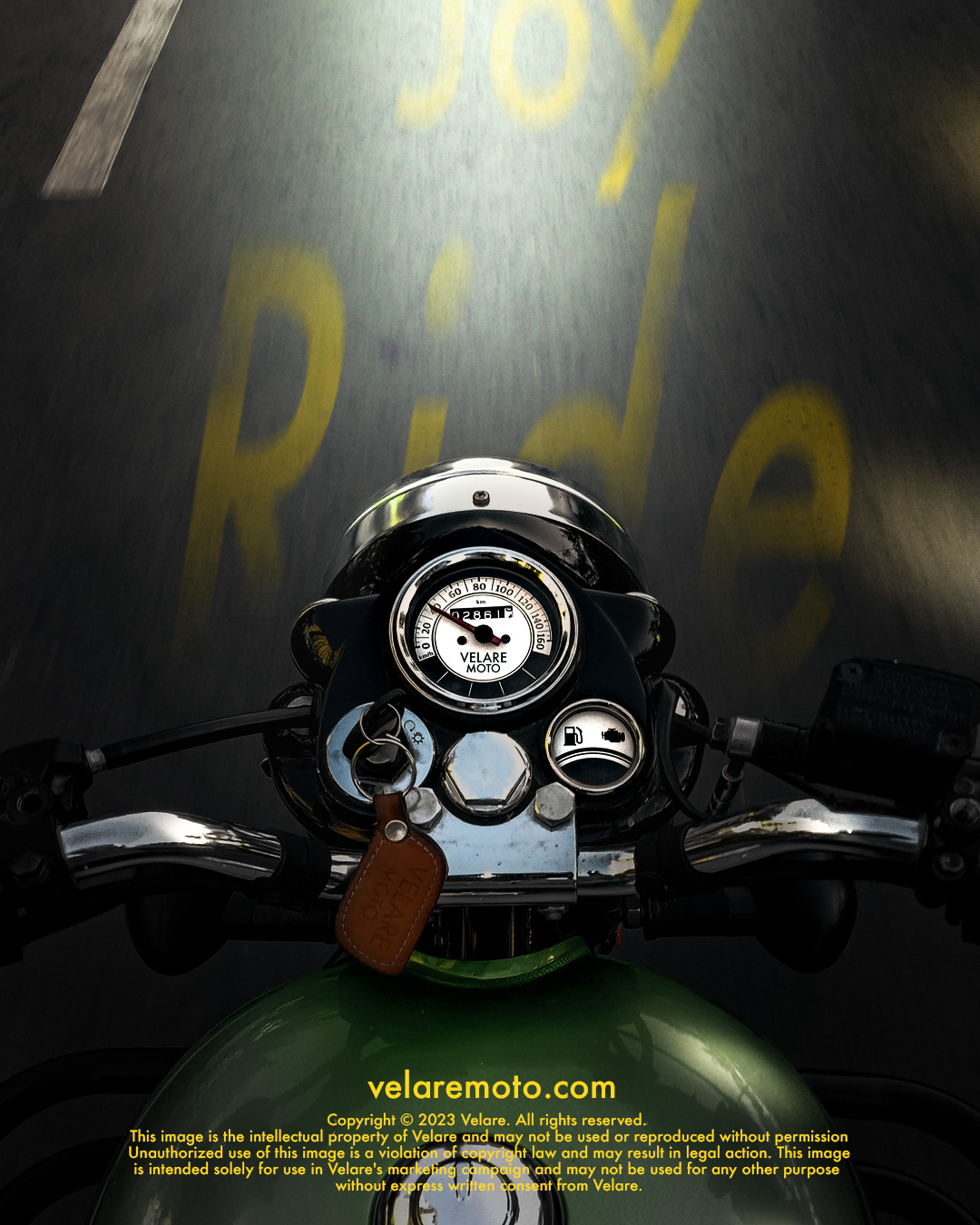
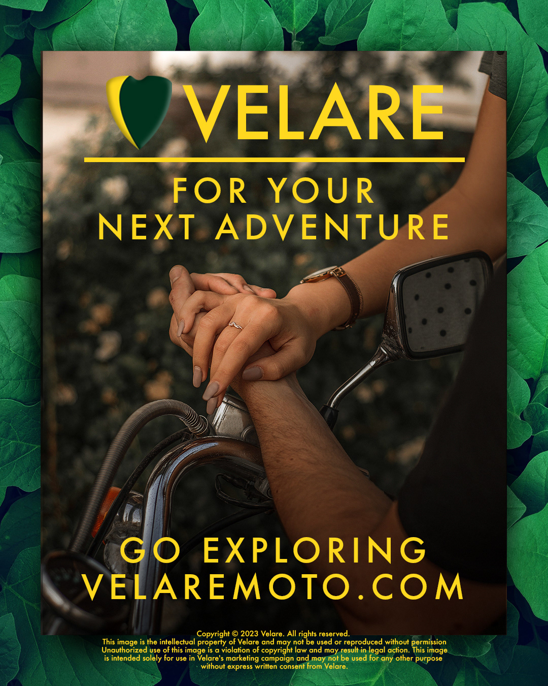
Actual images of couples enjoying motorcycles will capture the attention of Velare's target audience. Close-up shots of various components will tell the story of their craftsmanship and attention to finer details, but also what features and benefits are included.
Whenever possible, Velare will use the Futura typeface in its medium font. This is an elegant and distinctive geometric sans-serif typeface that is legible in various sizes.
Their brand colors will be present in their visual projects. The end goal is to have the logo recognized in the minds of viewers and not need the wordmark included.
Velare will give a sense of reliability, approachability, and elegance with their visuals throughout their communications, online presence, and messaging.
Velare Brand ID Visuals

